case study
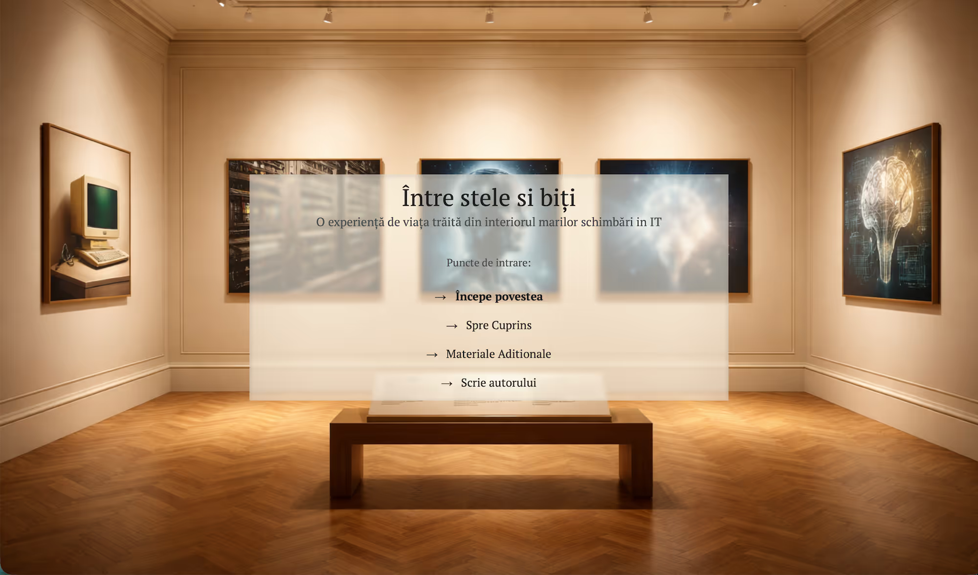
My IT Journey
A digital archive of Romanian computing history.

case study
A digital archive of Romanian computing history.
project context
My IT Journey is not a conventional website, blog, or digital book.
It is a living digital archive that documents the evolution of information technology through the direct lived experience of one of Romania’s earliest computer scientists.
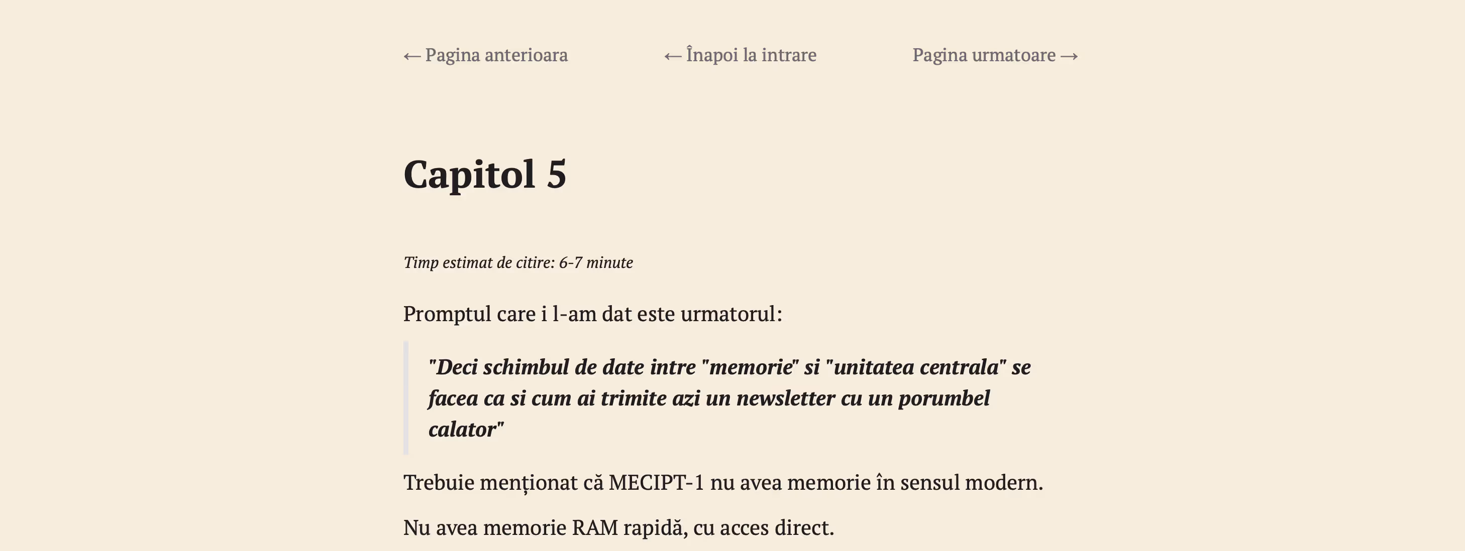
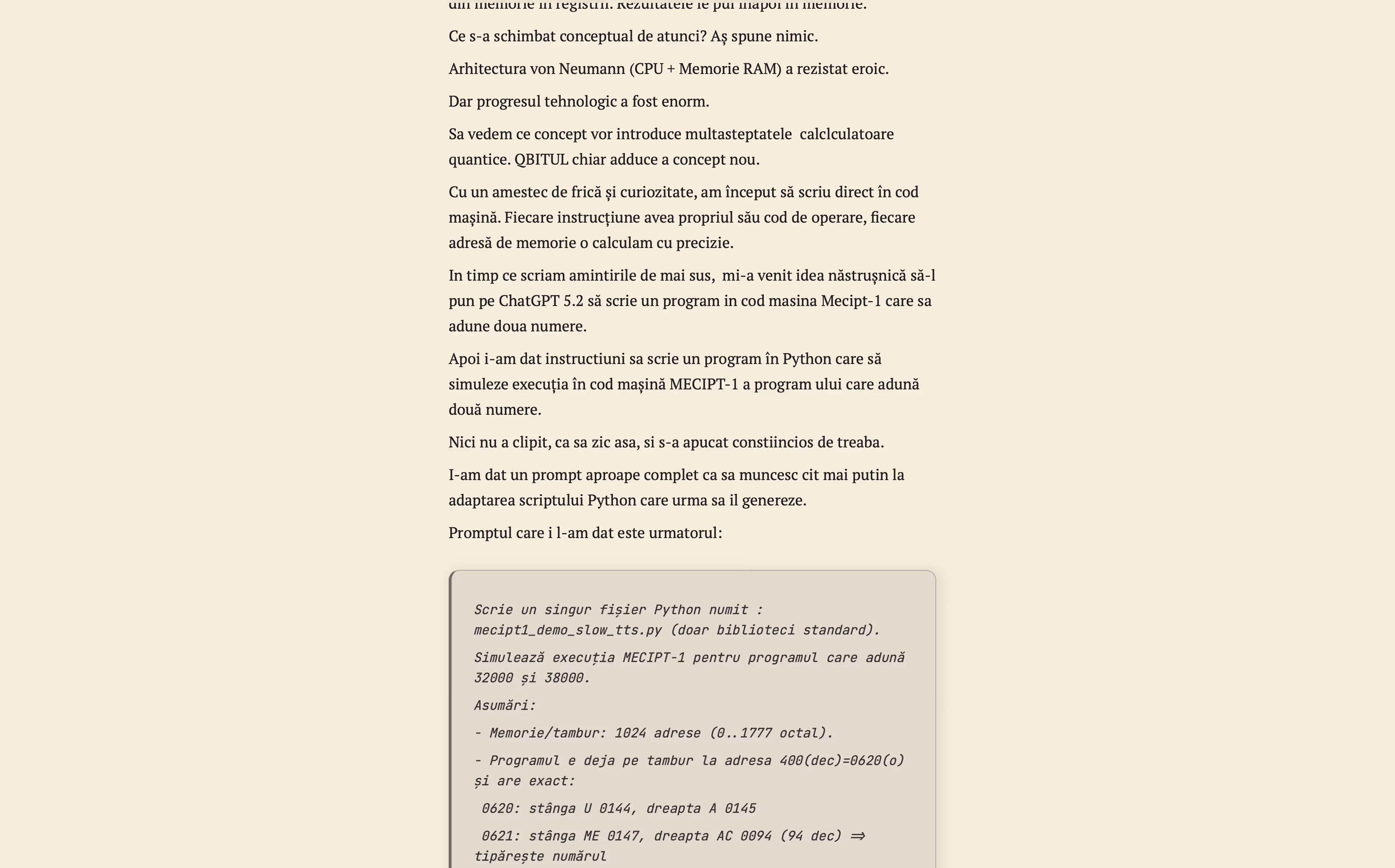
The content spans more than six decades - from punched cards, drum memory, and early institutional computing systems (including MECIPT), to modern software development and artificial intelligence.
From the start, the challenge was not visual or technical in isolation, but architectural:
How do you translate 60+ years of technical memory into a modern, readable, scalable, and future-proof digital system - without breaking historical tone or cognitive flow?
ARCHITECTURAL VISION
The core strategic decision was to treat the website as a system, not a collection of pages.Just as early computing centers were designed around clear functional principles:
input, processing, memory, output, and error tolerance, the website mirrors the same logic.
Classical IT Concept
Website Implementation
Input
Reading, navigation, contact (“Scrie autorului”)
Processing
Chapter segmentation, progressive disclosure
Memory
Persistent navigation, chapter state awareness
Output
Typography-first rendering, device-adaptive layout
Error tolerance
Cognitive load control, predictable scrolling
This alignment was deliberate. The medium reflects the subject matter - systems thinking applied to storytelling.
information architecture
Life is continuous. Computers are modular.
To make decades of lived experience readable and navigable, the project applies IT-grade modularization:

• Where am I?
• What am I reading?
• Where can I go next?
This mirrors instruction-pointer logic in early CPUs: execution must always know its current state.
The result is a reading experience that feels natural, even as the underlying structure is rigorously defined.
PROGRESSIVE DISCLOSURE
Long-form technical memory can overwhelm readers. The solution was progressive disclosure, a concept common in operating systems, IDEs, and expert software tools.
Implementation includes:
Optional “Read more blocks” expansions
Technical deep dives separated from narrative flow
A readable core experience even when expansions are skipped
This allows:
Non-technical readers to stay engaged
Technical readers to explore depth without breaking rhythm
Narrative continuity is preserved, regardless of reader profile.
Once the structure was stable, the focus shifted to endurance - how long someone could read without fatigue.
Typography was treated as a functional layer of the system - not as visual styling.
The site is designed for sustained reading, where comfort matters more than expression.
Typeface, line length, and hierarchy were chosen to reduce fatigue, support long sessions, and make complex material easier to parse.
The result is text that feels calm, predictable, and readable over time, not just at first glance.
Navigation is always present and always predictable.
Rather than guiding the reader through persuasion, it functions as state management, ensuring the reader never feels lost, reset, or unsure of their position within the journey.
The structure remains constant:
Previous · Cuprins · Next
This creates a rhythm similar to a call stack in computing:
you know where you are, where you came from, and where you can go next.
The website is built on Webflow by deliberate choice.
Not for flexibility, but for control.
By avoiding CMS complexity and dynamic dependencies, the system remains stable, predictable, and easier to maintain long-term.
Visual precision is retained, behavior is deterministic, and the content remains fixed, exactly as intended.
Much like early computing systems, the priority here is simple:
clarity over abstraction, predictability over excess flexibility.
Artificial intelligence was used transparently and selectively, as a support layer, not a replacement.
AI assisted with structure, rhythm, and linguistic refinement, helping the material become clearer without altering its meaning. It never generated content, replaced memory, or acted as a historical authority.
This follows a modern human-in-the-loop approach:
AI amplifies cognition, but authorship remains human.
Search optimization was implemented with restraint.
The site uses clean semantics, canonical URLs, chapter-level metadata, and sitemap-driven indexing, just enough to make the archive discoverable without distorting its purpose.
There is no clickbait, no keyword manipulation, and no content written for algorithms instead of readers.
Analytics are anonymized and used only to understand how the archive is read:
where attention deepens, where it fades, and how the structure can improve over time.
Integrity comes before visibility.
At this point, the website stops behaving like a product - and starts behaving like a system.
Most websites are built to persuade, convert, or sell.
My IT Journey is built to preserve knowledge.
From an implementation perspective, the project is rare because it applies systems thinking to narrative design, treating UX as cognitive infrastructure and history as structured data.
The same principles that shaped the evolution of computing are embedded into the medium itself.
From punched cards to neural networks,
the message and the system finally speak the same language.
This project reflects how we approach non-standard, high-care digital work.
It is best suited for initiatives where clarity, structure, and longevity matter more than speed or scale, such as personal archives, long-form authorship, research-driven projects, or educational and historical platforms.
While most of our work focuses on business growth, the underlying principles remain the same:
restraint, structure, and respect for the user.
This project is technically credible, intellectually coherent, calmly confident, and fully aligned with how ROSOL approaches digital work.
If you’re not sure which service fits your situation,
a short strategy call is the best place to start.